


Itâs a fact that you canât fight gravity as long as youâre on this planet. What goes up must come down. Take a ball for example. You throw it up, and it comes back down. Itâs easy to see this take place.
The problem is, if you are looking at a still image, you canât always tell if something is on its way up or on its way down. To figure out which way itâs moving, you need more than one picture, or more than one moment in time.
Single Snapshots vs. Views over Time
If you are looking at a photograph of a ball in mid-air, can you tell whether itâs on its way up or on its way down?
Probably not.
A single frame in mid-motion will not tell you direction. But if you also had a picture of the same scene, taken just a split second before or after, you could compare the two pictures. You could see the direction of the movement, whether it was up or down.
The same principle applies with online sales, and we can compare the flight of a ball to the life cycle of your product. You need to look at demand for the product over time and decide what it means.
Every product has a life cycle. In the beginning, demand rises because of a lack in supply. At some point, demand begins to level out and balance with supply. Then, toward the end, demand falls and supply rises.
Going Up?
To make my point, Iâm going to start this discussion with a quiz, based on the search results for remote control toy aircraft below:
img src="/my_files/Image/auction_ography/cat3/051607/ch5_1.jpg" border="no">Figure 1: Thirty-Day Snapshot of Remote-Control Aircraft.
Question: Using the information in the research results in Figure 6.1, can you tell whether demand is increasing or decreasing? How about supply?
Answer: Iâm guessing you already know the answer. But, Iâm trying to make a point. You canât tell whether itâs increasing or decreasing because you are looking at a âfreeze frameâ of the market. Itâs going to take several snapshots to look at a productâs performance over time.
What to Watch over Time
Determining whether a product is on its way up, steady, or on its way down is just about as simple as looking at several photos to decide the direction a ball is traveling. You do basically the same thing by taking snapshots of the productâs performance at different points in time and comparing them.
In this case, weâre going to look at some snapshots, week-by-week, for the thirty-day period shown in Figure 1. Below are four snapshots for each week of the thirty days. Pay close attention to the bolded numbers in the figures. They are:
- The total number of listings (supply)
- The LSR (sales rate, which is the demand in sales)
- The ASP (selling price)
- The total sales in dollars (demand in dollars)
IMPORTANT: When you get your research âsnapshots,â youâll just use your research tool to run your research week-over-week, and then save your reports.
Week 1
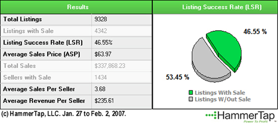
Figure 2: Week 1 Snapshot for Remote-Control Aircraft
Week 2
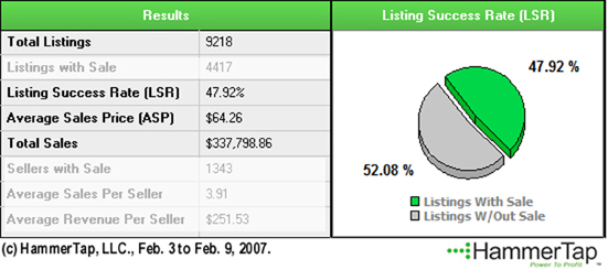
Figure 3: Week 2 Snapshot for Remote-Control Aircraft
Week 3

Figure 4: Week 3 Snapshot for Remote-Control Aircraft
Week 4
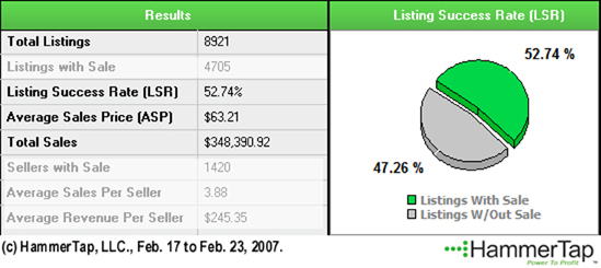
Figure 5: Week 4 Snapshot for Remote-Control Aircraft
Remember, in the figures above, weâre looking for:
- The total number of listings (supply)
- The LSR (sales rate, which is the demand in sales)
- The ASP (selling price)
- The total sales in dollars (demand in dollars)
Comparing the Results
Comparing the results over time provides us some subtle clues about how this product has performed over time, and the direction itâs going in. Table 1, below, pulls it all together.
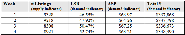
Table 1: Week-by-Week Demand Comparison
Thereâs a short and long explanation of how this product performed over time.
The short explanation is that it is remarkably stable, with an up-turn in the overall dollars consumers are spending for this product on the market.
The long explanation is that this product has not remained static. We do not see a drop in conversion rate (LSR) or selling price (ASP) over the four weeks. On the contrary, we see a climb in overall sales (Total $).
Although the total number of listings (supply) has decreased by five hundred listings from week one to week four (1,000 from week one to week three), we see an increase in Total Salesâan $11,000 difference from week one to week four.
This is encouraging. It doesnât necessarily mean that we will see a sharp increase in sales. But at the same time, we can definitely see that this product is not on its way down. With this information, you could predict that steady sales will continue.
Where is Your Product in Its Life Cycle?
Every product goes through a cycle that begins with a little interest, then attracts more buyers (demand) and not enough sellers (supply), and gradually ends up with too many sellers (supply) and not enough buyers (demand).
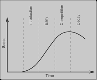
Figure 6: The Product Life Cycle
But how do you decide where a product is in its life cycle? Again, we turn to the data to find out. What weâre looking for is how supply and demand change over time. Figure 6 in my previous post gives us a quick-reference way to remember:
- Early Phase - Increasing buyers, few sellers
- Competition Phase - Buyers remain steady, but competition is increasing
- Decay Phase - Decreasing buyers with even more sellers
And that's a perfet place to pause. Stay tuned next week when I will discuss each phase of the product life cycle in complete detail and have research examples.